How to create a bar or column chart in Excel
Just about everyone needs to create charts using data in Excel, yet creating charts in Excel can be a frustrating process. This lesson starts with the basics, and shows you how to create a basic column or bar chart in Excel.
Note that this lesson has been written using examples from Excel 2010, but the basic concepts apply to other versions of Excel. However, be aware that Microsoft continues to improve and evolve the charting feature of Excel, so earlier versions may not have all the features discussed in this lesson. Excel 2013 adds some new features that aren't covered here.
To learn how to create a column chart in Excel, let's use a simple example of some monthly sales and expense data that we want to show in a chart format. Note that a column chart is one that presents your data in vertical columns. A bar chart is very similar in terms of the options you have, but presents your data in horizontal bars. The steps below take you through creating a column chart but you can also follow them if you need to create a bar chart.
Preparing your chart data
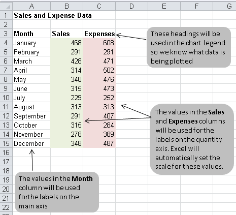
The table below shows the data we want to chart. It's important that your data be presented correctly in order to create a good looking chart.
Note the following points relating to the data table below:
- The Sales and Expenses headings will be used in the legend of our chart. Changing them here will update the legend in your chart.
- The data in the first column (Month) will be used as labels along the horizontal side of the chart (this is known as the X axis).
- The data in the Sales and Expenses columns will be used to determine the labels for the vertical side of the chart (this is known as the Y axis). Because these columns contain numbers, Excel will automatically work out the Yaxis labels for you, including the start and end values, and the steps in between.
Creating Your Column Chart
Once your data has been prepared correctly, you are ready to create your chart. This is a fairly quick process, but it does involve a number of steps:
- First select your data, making sure that you include all of the data that is to be included in the chart.
- In our example above, that means selecting the range of cells from A3:B15.
- It's important to remember to include the row headings if you want to use those values as axis labels on your finished chart.
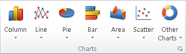
- Next, click Insert in the menu. The ribbon will change, and will include a number of chart options like this:
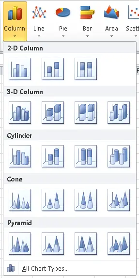
- In our case we are creating a Column chart, so click the Column button. The following options will then be displayed. As you can see, there are many options available. In our case, we'll keep it simple and choose the first option, which is a 2D Clustered Column Chart. We can change it to one of the other chart types later if we decide that this one doesn't suit our requirements.
- Once you select a chart type, Excel will automatically create the chart and insert it onto your worksheet.
- The location where the chart is inserted may seem random, but it isn't. In fact, Excel will place your chart in the centre of the Excel window.
- This allows you to select data in one location and then scroll to another location within the worksheet to insert the chart.
- This may not always be what you want, but you can move the chart later if you need to.
- Here's what our chart looks like at this point:
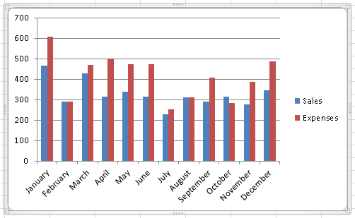
- Note the following points about this chart:
- The month labels are listed along the X (horizontal) axis. Excel has automatically put them on an angle to fit neatly into the space available.
- The legend to the right of the chart contains the column heading from our spreadsheet. You can change them by editing the headings in our data table.
- The Y (vertical) axis starts at 0 and goes to 700 in steps of 100. Excel figured this scale out by looking at the data. If you change your source data, then the scale on this axis will change automatically. However, you can also override the scale on this axis if you need to.
- Excel has chosen these colours based on a default theme. You can change the theme if you need to, and the colours will change automatically. You can also override the colours manually if you need to.
- There is no title on the chart by default. You can add one manually, or choose a chart layout that includes one.
Common Data Problems with Excel Charts
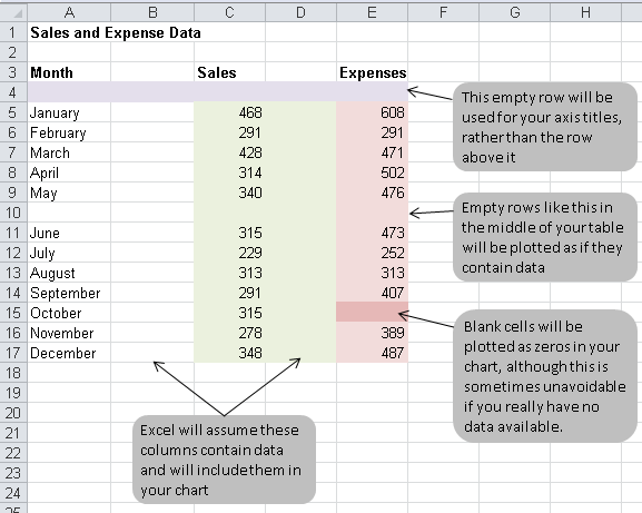
Now that we've created a basic column chart in Excel, let's finish by looking at some common problems people encounter when creating charts. These problems usually boil down to trying to create a chart from data that isn't correctly set up to be used by Excel for a chart. The picture below shows you some of these common errors:
- Many people include a blank row between their headings and their data. If you do this, Excel will ignore your headings and use the blank row for the headings instead. Because the row contains no information, Excel will default to using default axis titles.
- Similarly, blank columns or rows in your chart data will result in those columns or rows being plotted as zero values in your chart. This can make your chart look odd, so it's best to avoid this mistake.
Summary
Creating charts in Excel is a fairly straightforward process, as this lesson has shown. However, you may have noticed a number of points in this lesson where you could have chosen different options. There are also things that we haven't covered in this lesson. We'll be covering in them in additional lessons, so watch this space. In the meantime, feel free to ask any questions you have about column charts (or any chart questions you may have) in the comments section below.
Join our mailing list
Our Comment Policy.
We welcome your comments and questions about this lesson. We don't welcome spam. Our readers get a lot of value out of the comments and answers on our lessons and spam hurts that experience. Our spam filter is pretty good at stopping bots from posting spam, and our admins are quick to delete spam that does get through. We know that bots don't read messages like this, but there are people out there who manually post spam. I repeat - we delete all spam, and if we see repeated posts from a given IP address, we'll block the IP address. So don't waste your time, or ours. One other point to note - if you post a link in your comment, it will automatically be deleted.
Здесь вы можете заказать копию любого сайта под ключ, недорого и качественно, при этом не тратя свое время на различные программы и фриланс-сервисы.
Клонированию подлежат сайты как на конструкторах, так и на движках:
- Tilda (Тильда)
- Wix (Викс)
- Joomla (Джумла)
- Wordpress (Вордпресс)
- Bitrix (Битрикс)
и т.д.
телефон 8-996-725-20-75 звоните пишите viber watsapp
Копируются не только одностраничные сайты на подобии Landing Page, но и многостраничные. Создается полная копия сайта и настраиваются формы для отправки заявок и сообщений. Кроме того, подключается админка (админ панель), позволяющая редактировать код сайта, изменять текст, загружать изображения и документы.
Здесь вы получите весь комплекс услуг по копированию, разработке и продвижению сайта в Яндексе и Google.
Хотите узнать сколько стоит сделать копию сайта?
напишите нам
8-996-725-20-75 звоните пишите viber watsapp